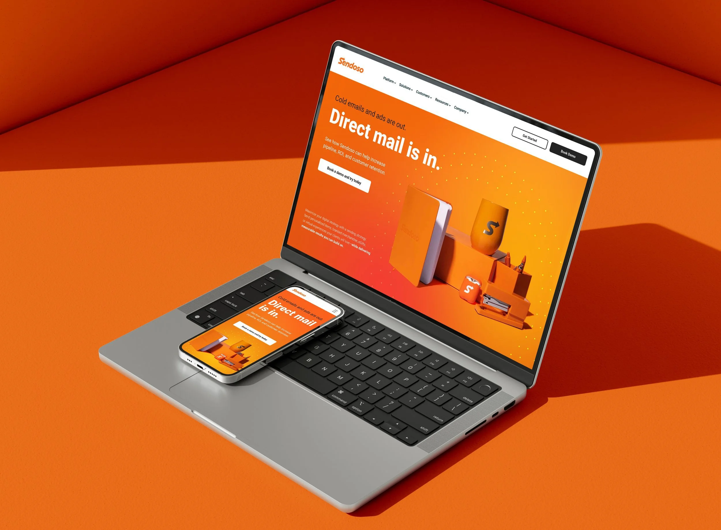
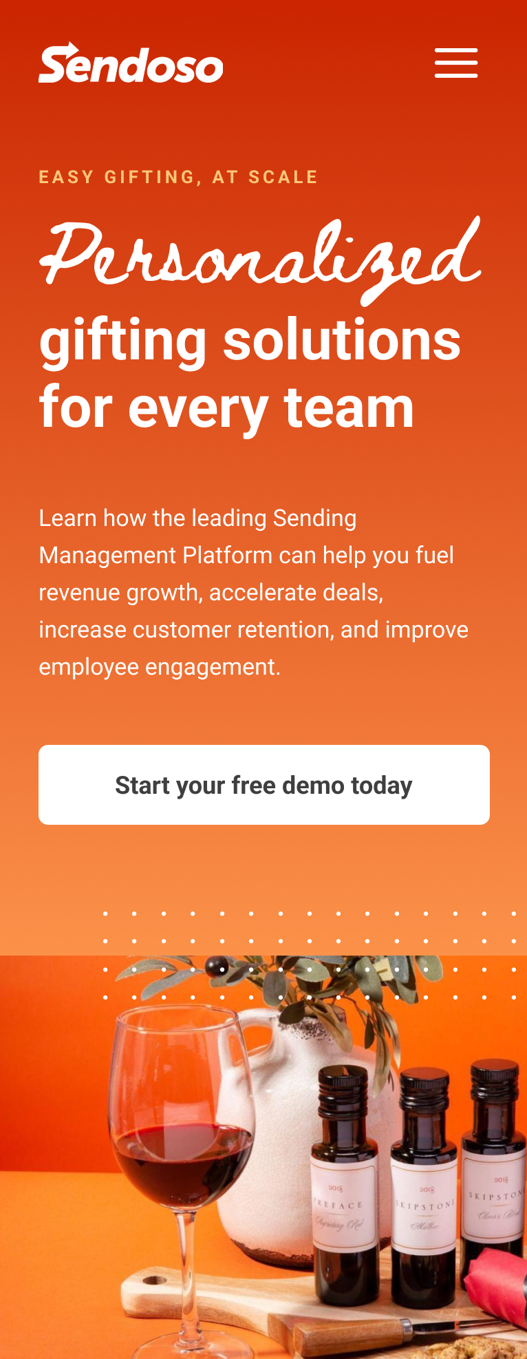
Sendoso Website Redesign
Client: Sendoso
Date: January 2022
Medium: UI/UX Design
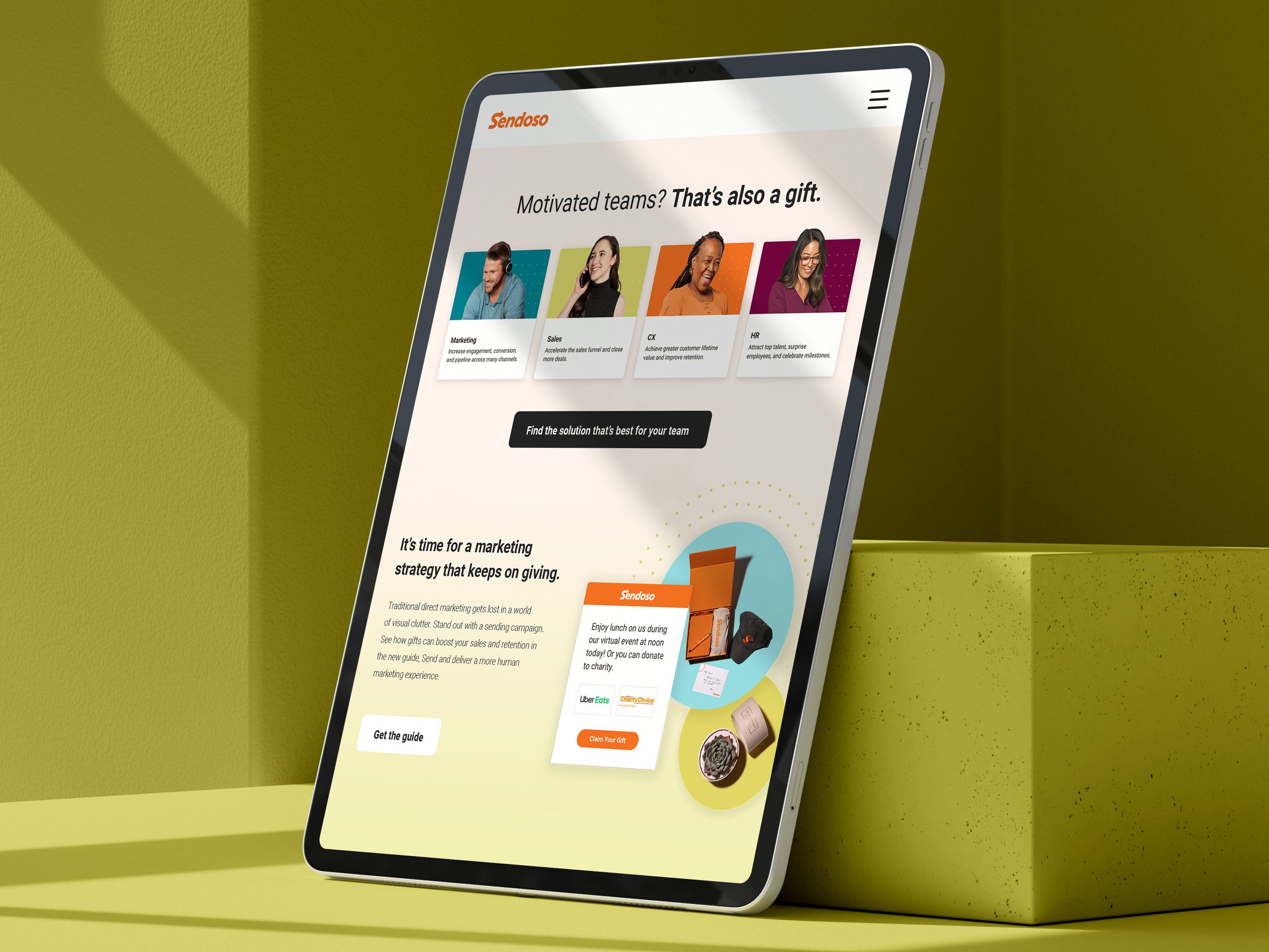

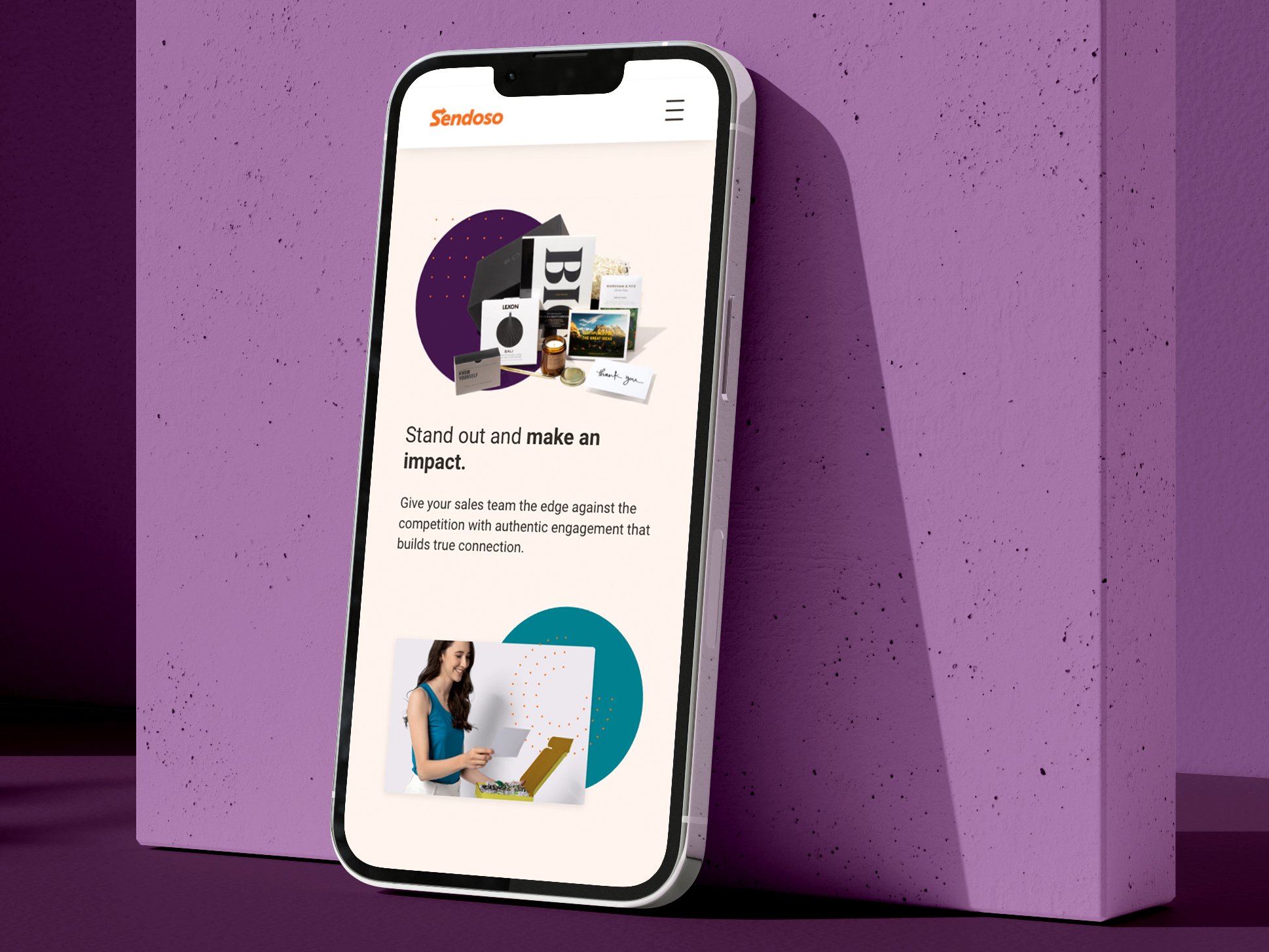
SUMMARY
Company description: Sendoso is a B2B SaaS company that specializes in sending personalized corporate gifts and direct mail to prospects, customers, and employees. Sendoso offers a platform that allows businesses to automate and scale their sending efforts to create meaningful connections with recipients. These personalized gifts and packages can be used for various purposes, including sales and marketing campaigns, customer engagement and employee recognition.
My role: The Sendoso creative team wanted a site refresh that uses cleaner design principles and simpler copy messaging for a less complicated user experience. They wanted to focus on how to help marketing, sales, and customer experience teams stand out by engaging at strategic points throughout the customer journey.
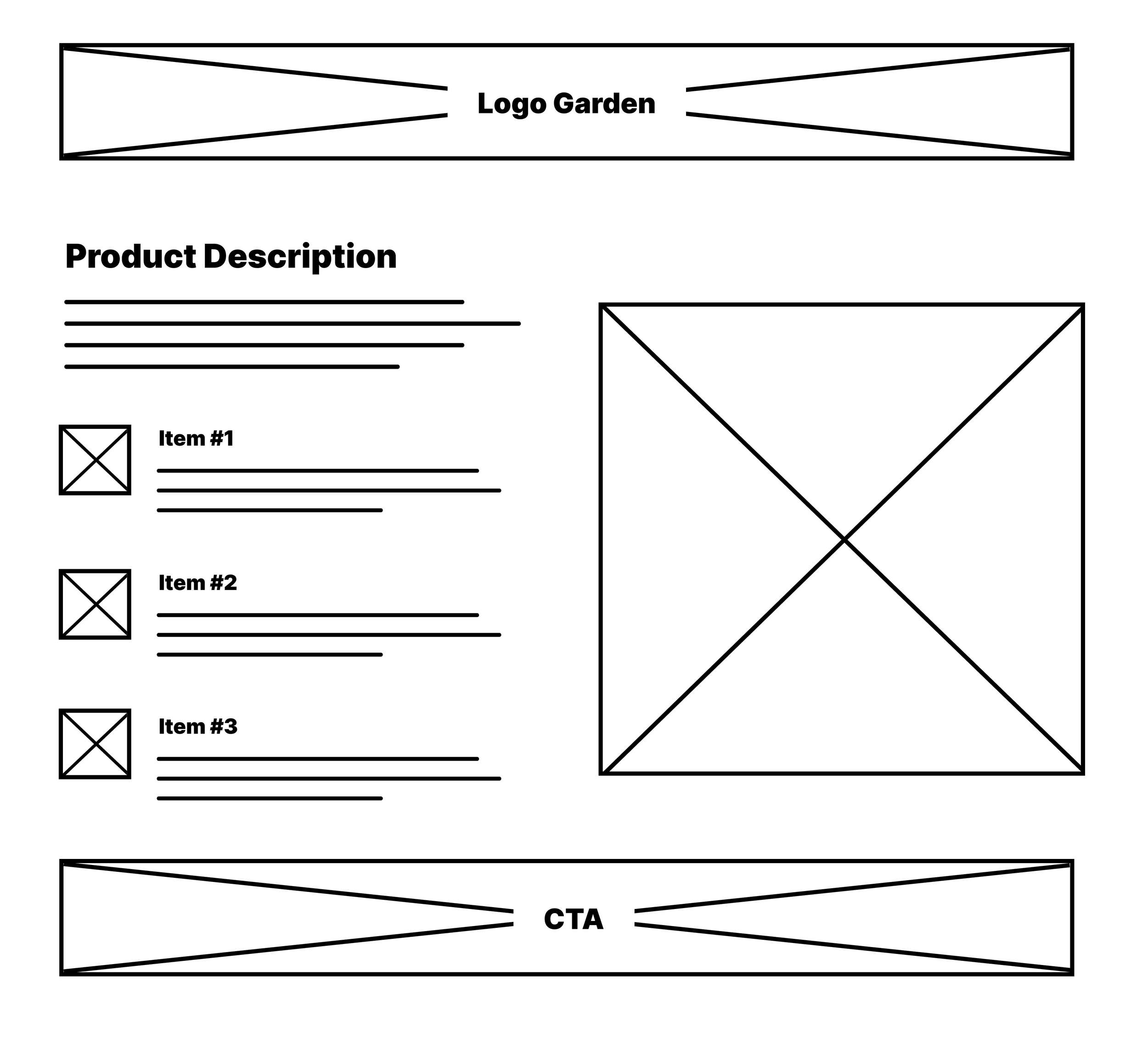
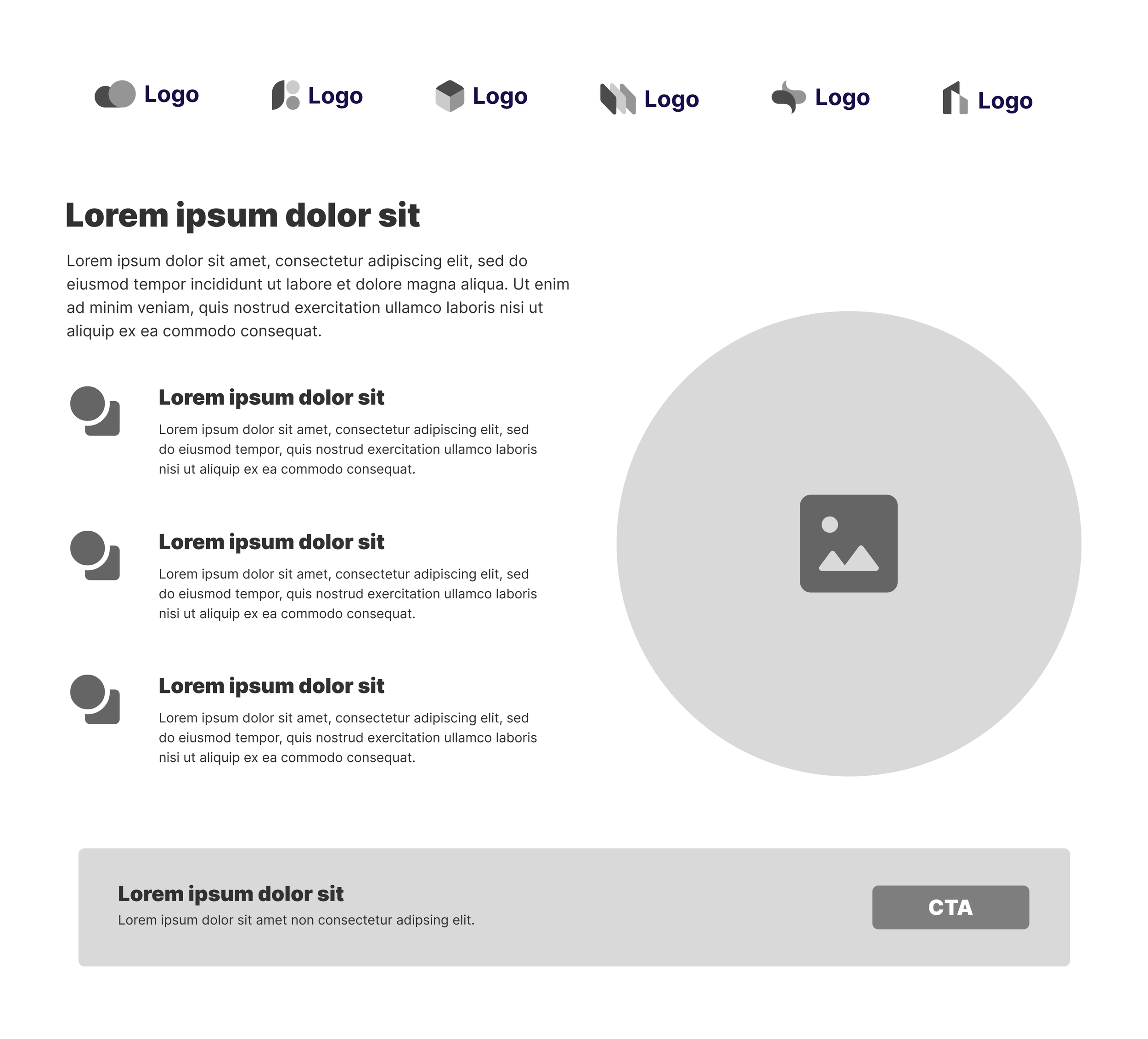
As lead UI designer, I worked directly with the lead UX researcher to develop wireframes, explain findings, and present functional prototypes for Sendoso’s team.
Project brief
SPECS
Software used: Figma
Skills: User interface design, user experience research, prototyping, image resourcing, client presentations
The process
PROBLEM SOLVING
One of the main problems that needed solving on this project was determining how to funnel Sendoso’s website traffic to specific subpages they wanted to promote. Sendoso wanted to keep most of their current website branding but implement cleaner design principles, friendlier messaging, and make significant changes to the user flow and site organization. Their focus was on how to help their marketing, sales, and customer experience teams stand out by engaging at strategic points throughout the customer journey.
SOLUTIONING
Our UX/UI team ultimately identified the following points as core Sendoso brand strategy pillars to solve this problem:
Clear path to conversion: Immediately orient the visitor to “who Sendoso is” via a focused platform strategy
Own your category: Optimize the homepage to empower each persona to easily and quickly opt into their desired journey
Uplevel content & messaging: Clean, modern design with flexible templates to grow with audiences
I worked directly with the lead user experience researcher to gain insights into the preferences and behaviors of the target users to determine the best information hierarchy. User journeys were outlined to interpret how different types of users/personas interact with the website—ultimately narrowing down the best ways to funnel traffic to the marketing, sales, and customer experience subpages. Click through rate analysis led to a creating a more prominent gateway to the marketing, sales, and customer experience subpages on the main homepage.
It was also determined during UX exploration that a portion of Sendoso’s main user base didn’t fully understand all of Sendoso’s company offerings. Part of the wireframing process was to simplify the visual hierarchy of the site and also ensure the main page quickly and succinctly explained Sendoso’s main company offerings.
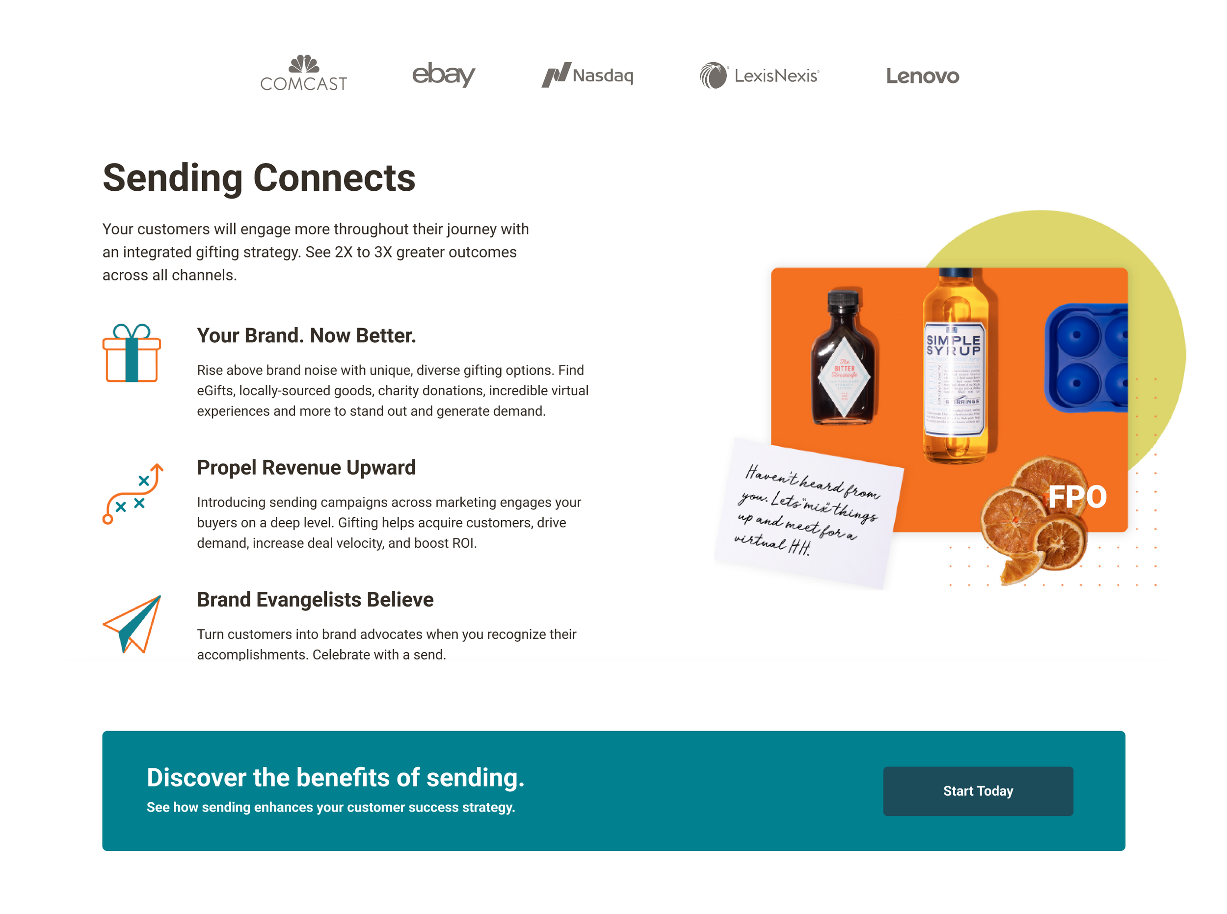
Using Sendoso’s current style guide, I simplified the visual site flow and modernized the aesthetics to be more friendly and engaging. I then developed high functioning prototypes to properly present interactive details, also ensuring that the user interface was responsive, adapting to various screen sizes and devices.
PROJECT REFLECTION
Working on this project allowed me to dig deep into Figma’s tools further than many other product design projects I had worked on to that point. Developing a style guide from scratch and creating component libraries allowed for a seamless design process throughout.

