LHI COVID-19 Scheduling
Client: Logistics Health Inc. / Optum Serve
Date: March 2023
Medium: UI/UX Design

SUMMARY
Company description: Logistics Health Inc. (LHI) was the federal health services business of both Optum and UnitedHealth Group. In 2021, LHI was formally renamed OptumServe—a division of Optum—which is a subsidiary of UnitedHealth Group. OptumServe focuses on providing health and well-being services to a wide range of clients, including federal, state, and local governments, as well as organizations in the private sector.
My role: As the head designer on this project, my responsibility was to lead all design changes end-to-end from user research to user interface prototypes. I worked with project managers and product specialists to gather information about user pain points and also collaborated with developers to create new feature components. Ultimately, I helped improve how LHI users searched for and scheduled COVID-19 testing appointments by making each stage of the process clearer and more streamlined.
Project brief
SPECS
Software used: Figma
Skills: User interface design, user experience research, prototyping, client presentations, Agile scrum
The process
PROBLEM SOLVING
A unique hurdle this project presented was shifting the problem that needed to be solved. I was first presented with one problem that needed resolving, but that seemingly small issue turned into a much larger challenge to solve and drastically increased the scope of the overall project.
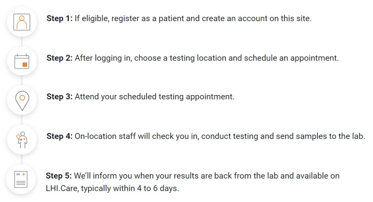
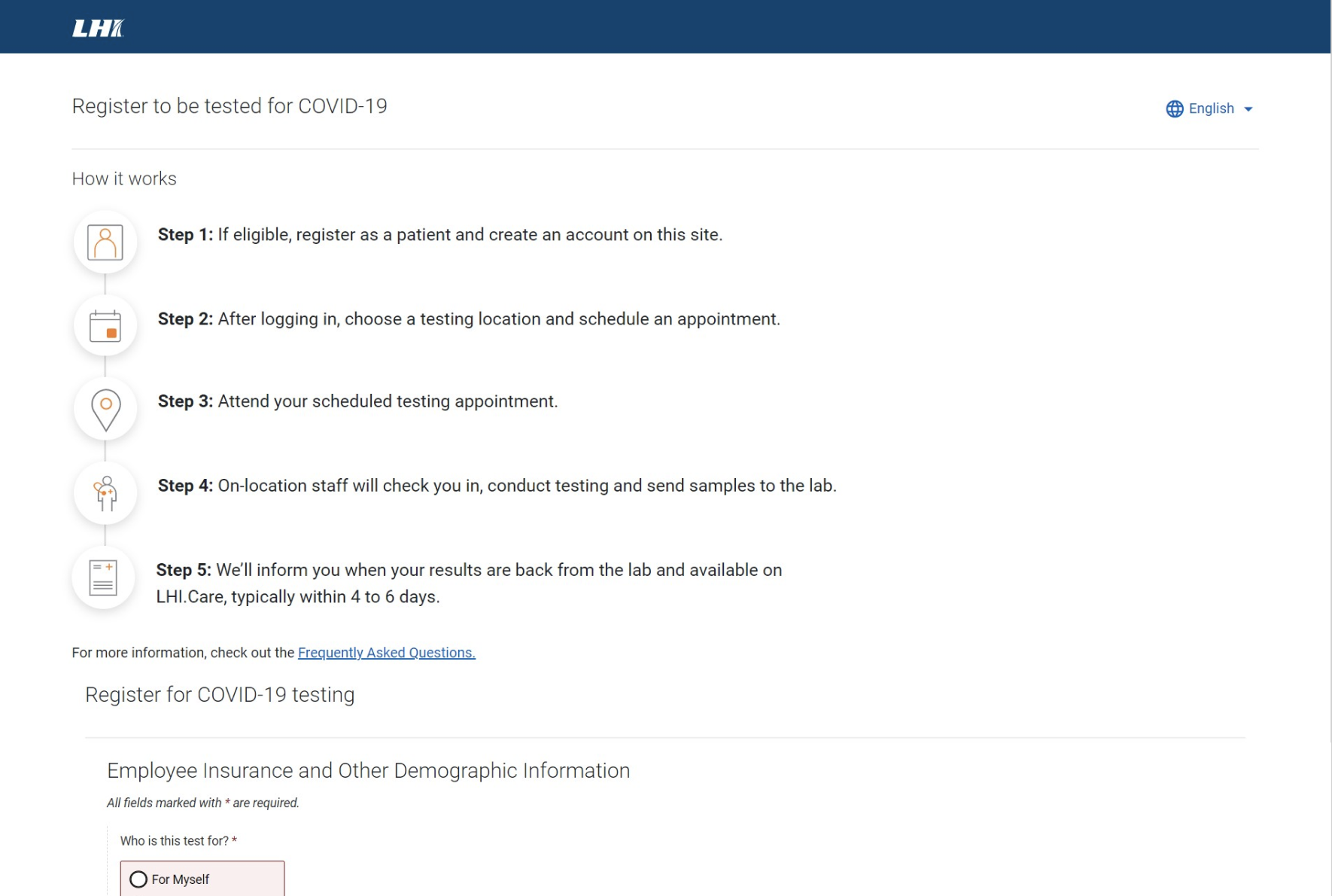
My initial request was to change a rasterized JPG image within LHI’s COVID-19 Schedule an Appointment page (explaining the steps a user will take to schedule an appointment) and convert the text to HTML and modernize the icons. (See image below.)
However, upon reviewing all the steps involved to schedule a COVID-19 appointment, there were more user experience issues to be addressed. The steps laid out in the JPG did not align with the actual process on the site, and user feedback also confirmed that patients were confused during the multiple-web page process to schedule an appointment.
SOLUTIONING
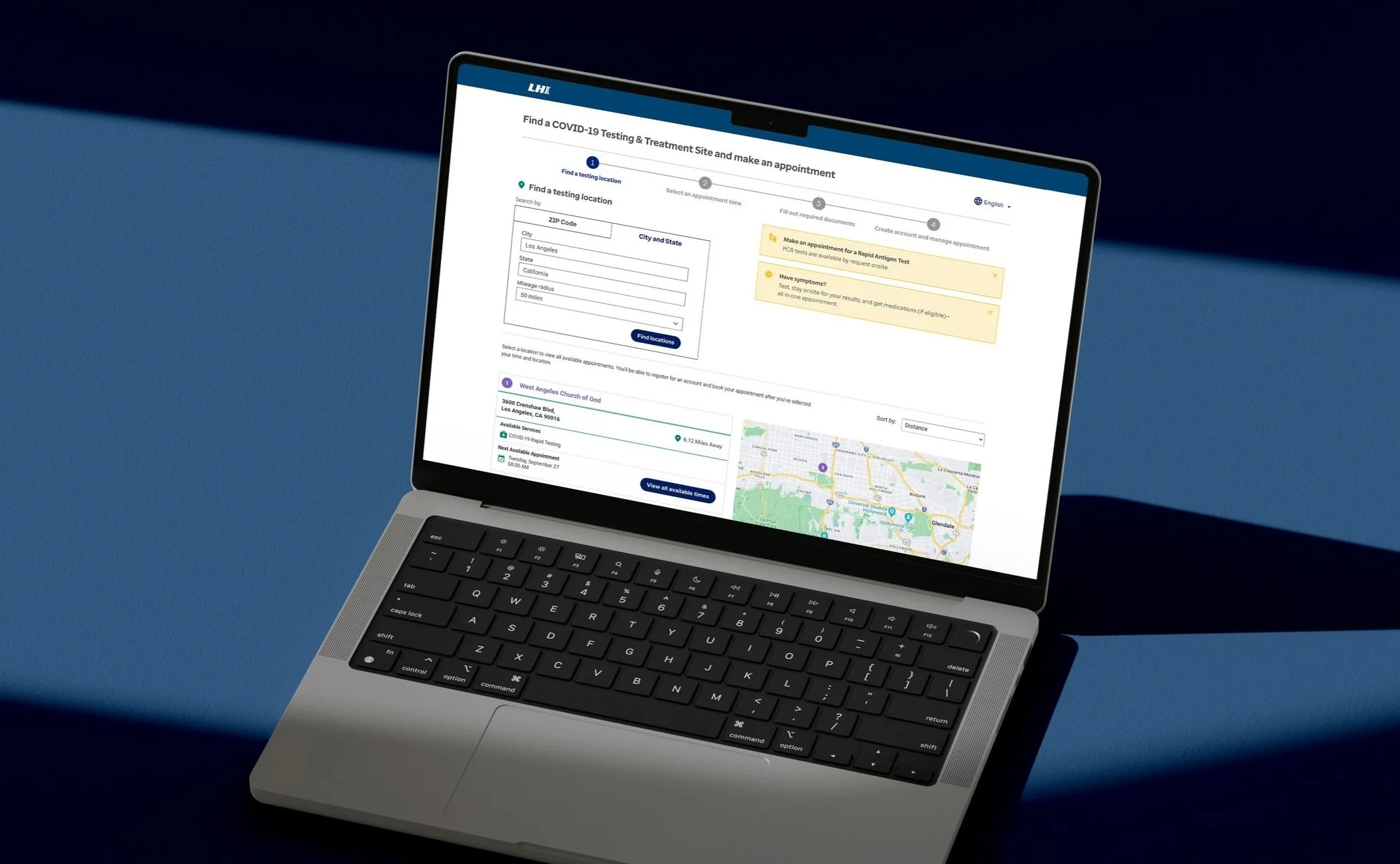
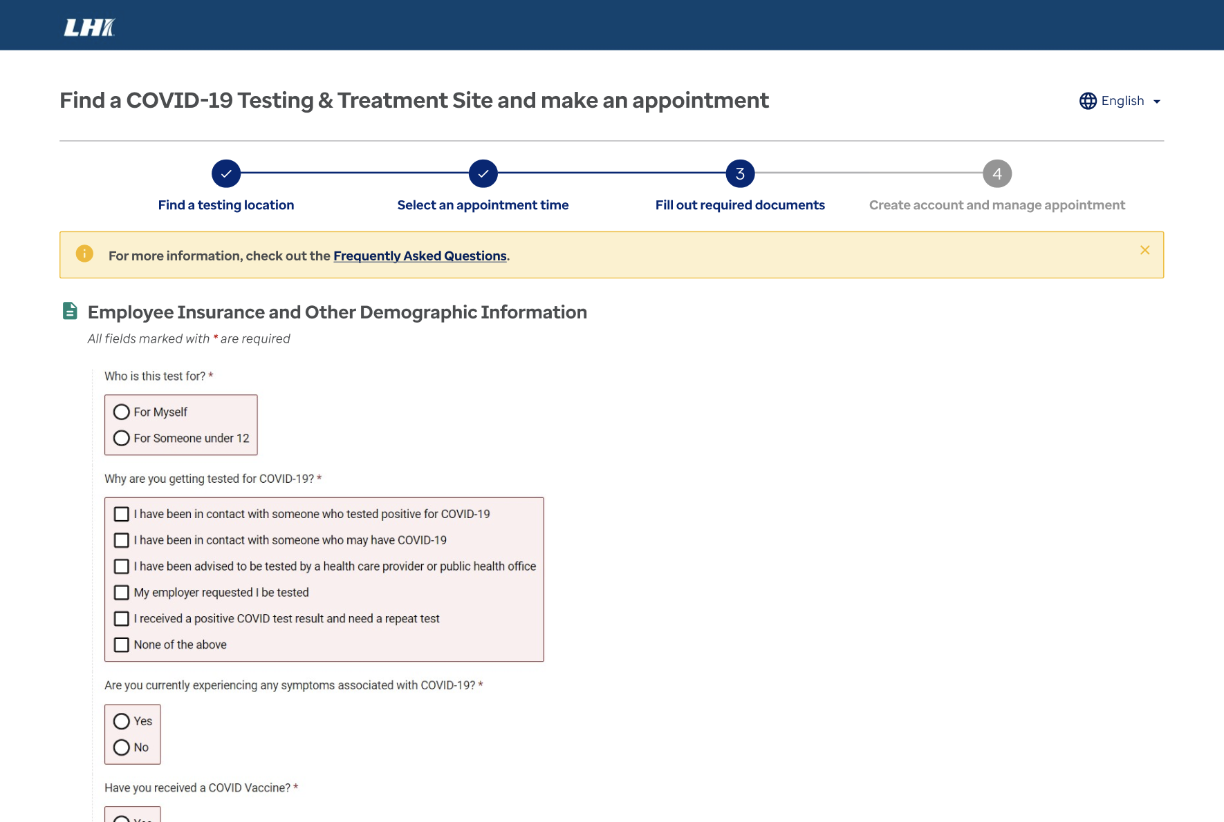
An empathy map was created to help determine which user pain points were most significant from the collected user comments. A common complaint was the amount of information a user had to scroll past to get to the pertinent form features to schedule a COVID-19 appointment. Additionally, users were confused by the JPG image because of its placement in the process and its information inaccuracy.
To resolve these issues, I targeted banner messaging that was taking up space at the top of the pages and restructured the layouts to present more important information immediately where users would most likely see it. I also worked with developers to add functionality to the banner messages allowing the user to close the message. Additionally, I reevaluated the necessity of having an image explaining the steps to schedule an appointment that only appears on one page of the multiple-web page process.
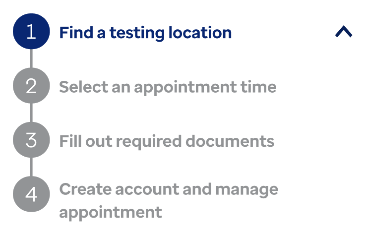
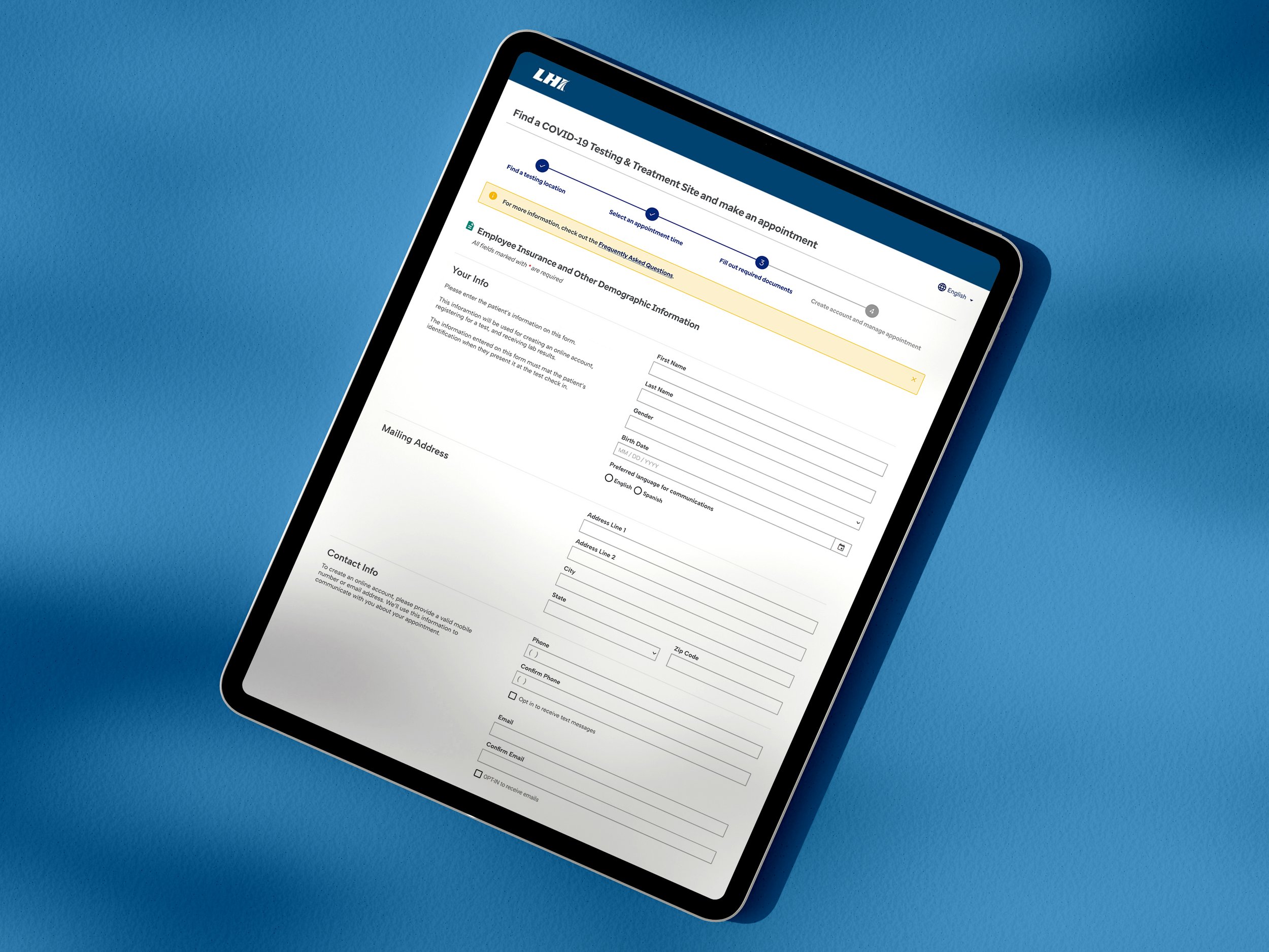
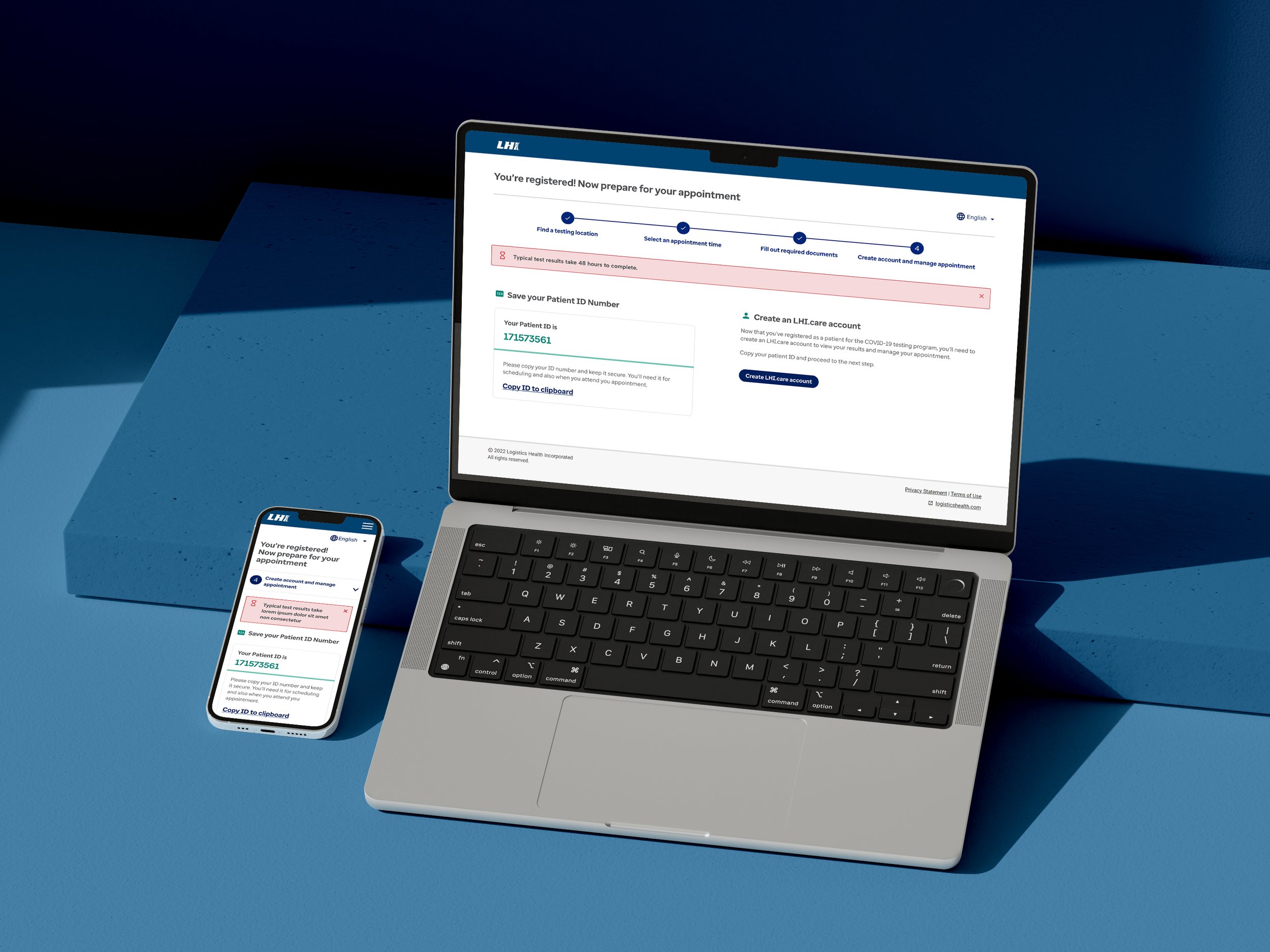
To resolve the latter, I reimagined the JPG image as a responsive stepper tool at the top of the page, allowing the user to know which stage of the scheduling process they’re actively in at all times.
Desktop
Mobile
PROJECT REFLECTION
I’m proud of my work on this projects for several reasons—not only was the user experience improved by directly addressing concerns from patients, but it also helped people access real-world healthcare more effectively. There was some initial worry at the beginning that my project proposals would have been too big of a scope for the team to take on, but I am proud how all the project managers, product experts, and developers came together and took on this larger project. Being able to explain my reasonings for expanding the project because of the user experience research I collected and presented was significant in getting approvals and buyoff.

