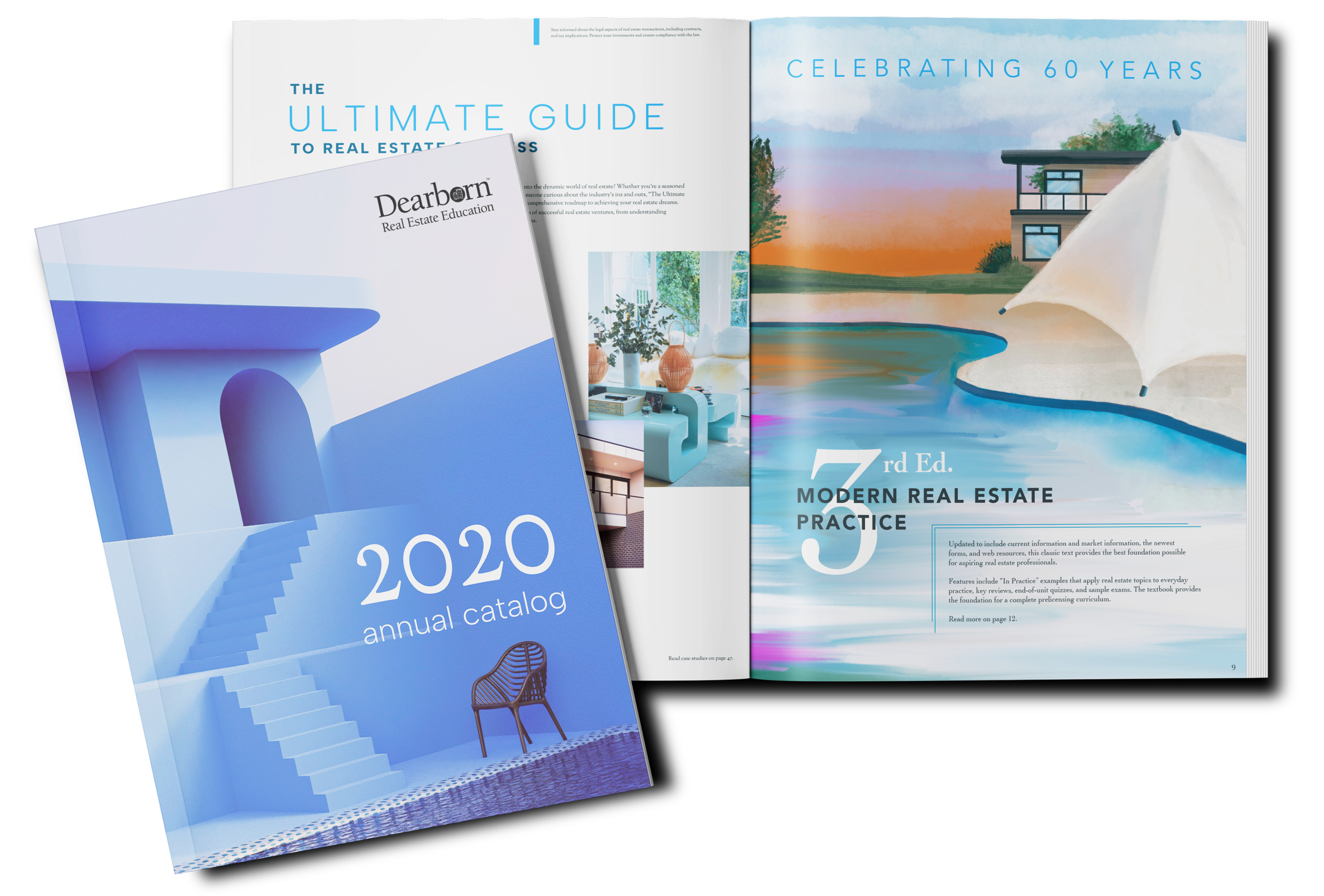
Dearborn Catalog Illustrations
Client: Dearborn Real Estate Education
Date: June 2019
Medium: Digital Illustration / Print
Project brief
SUMMARY
Company description: Dearborn Real Estate Education provides high-quality real estate licensing and continuing education content for real estate schools. Their annual catalog is a B2B print resource that provides detailed information about Dearborn’s current textbook offerings.
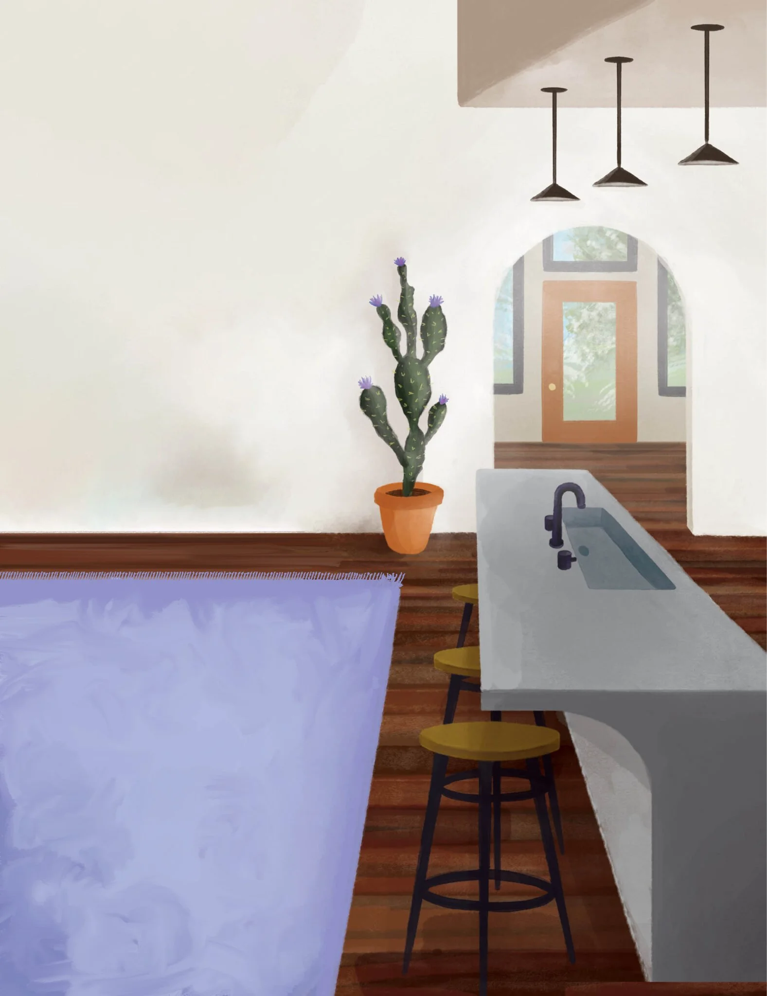
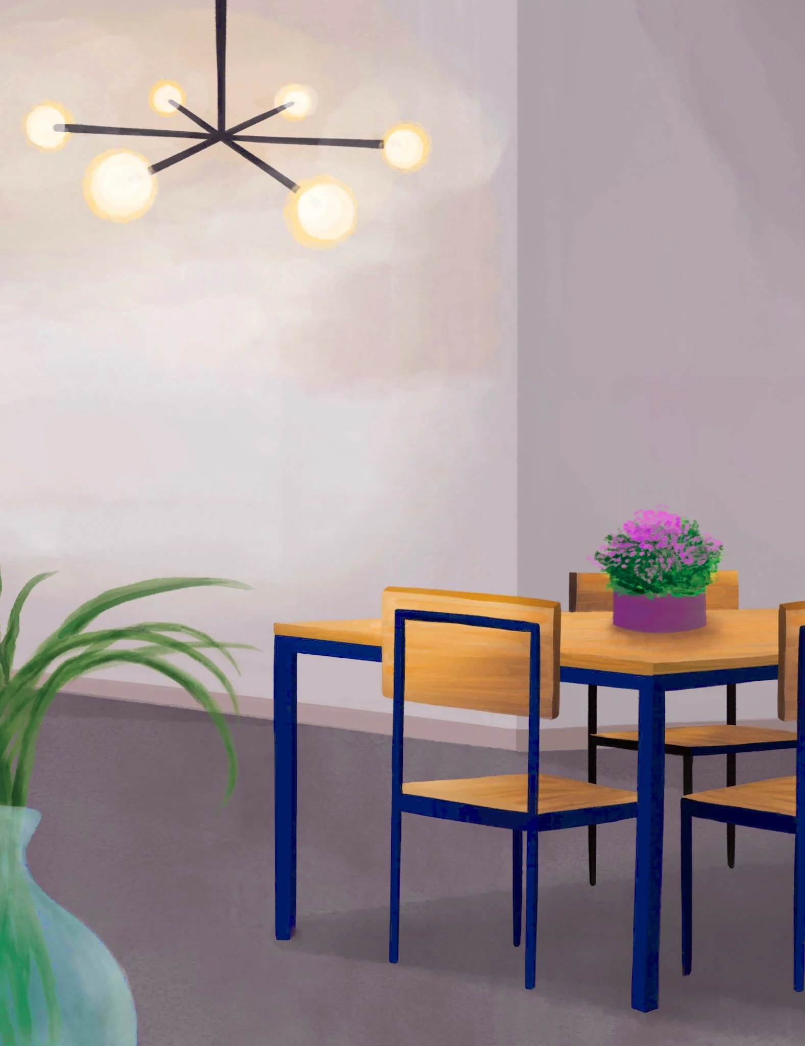
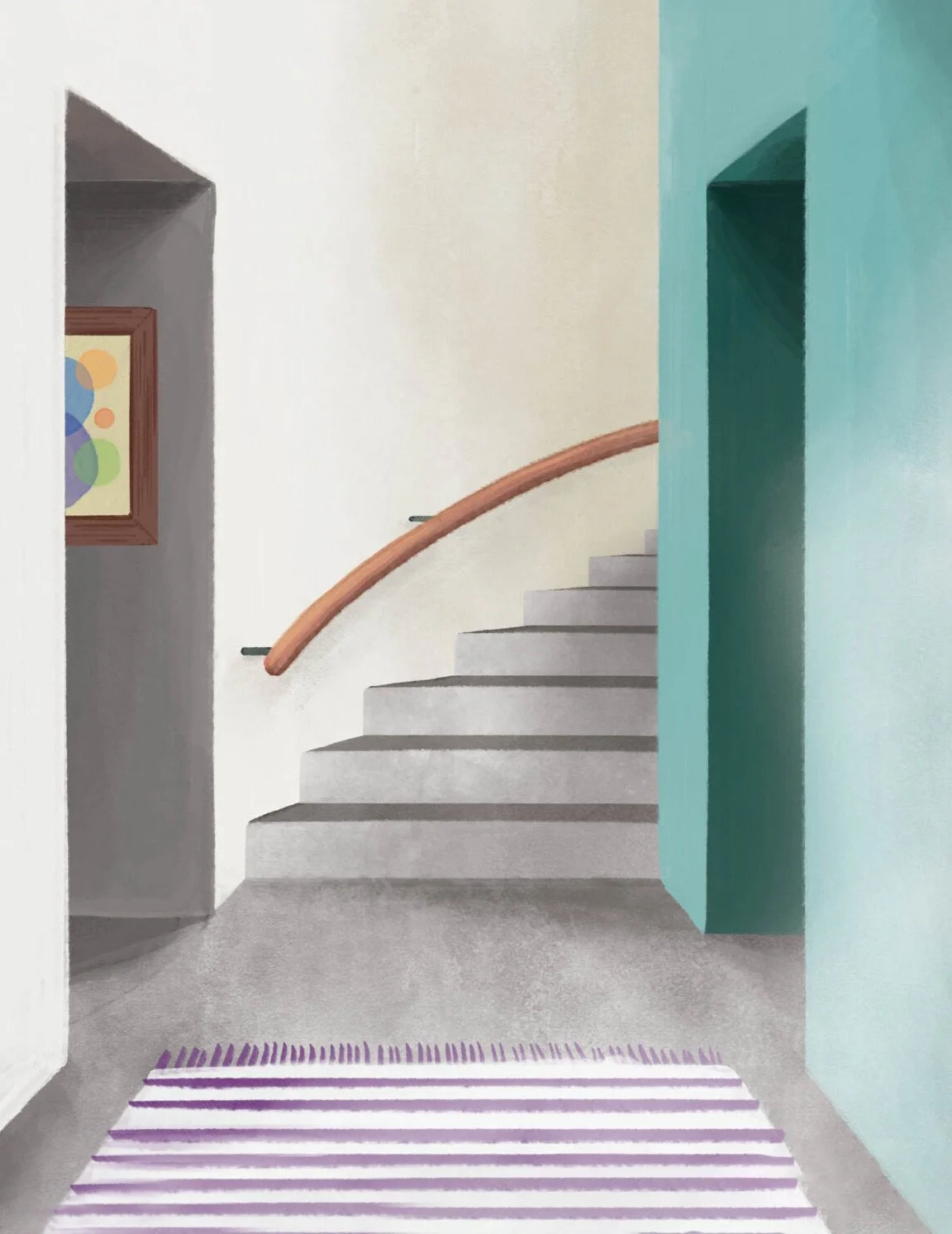
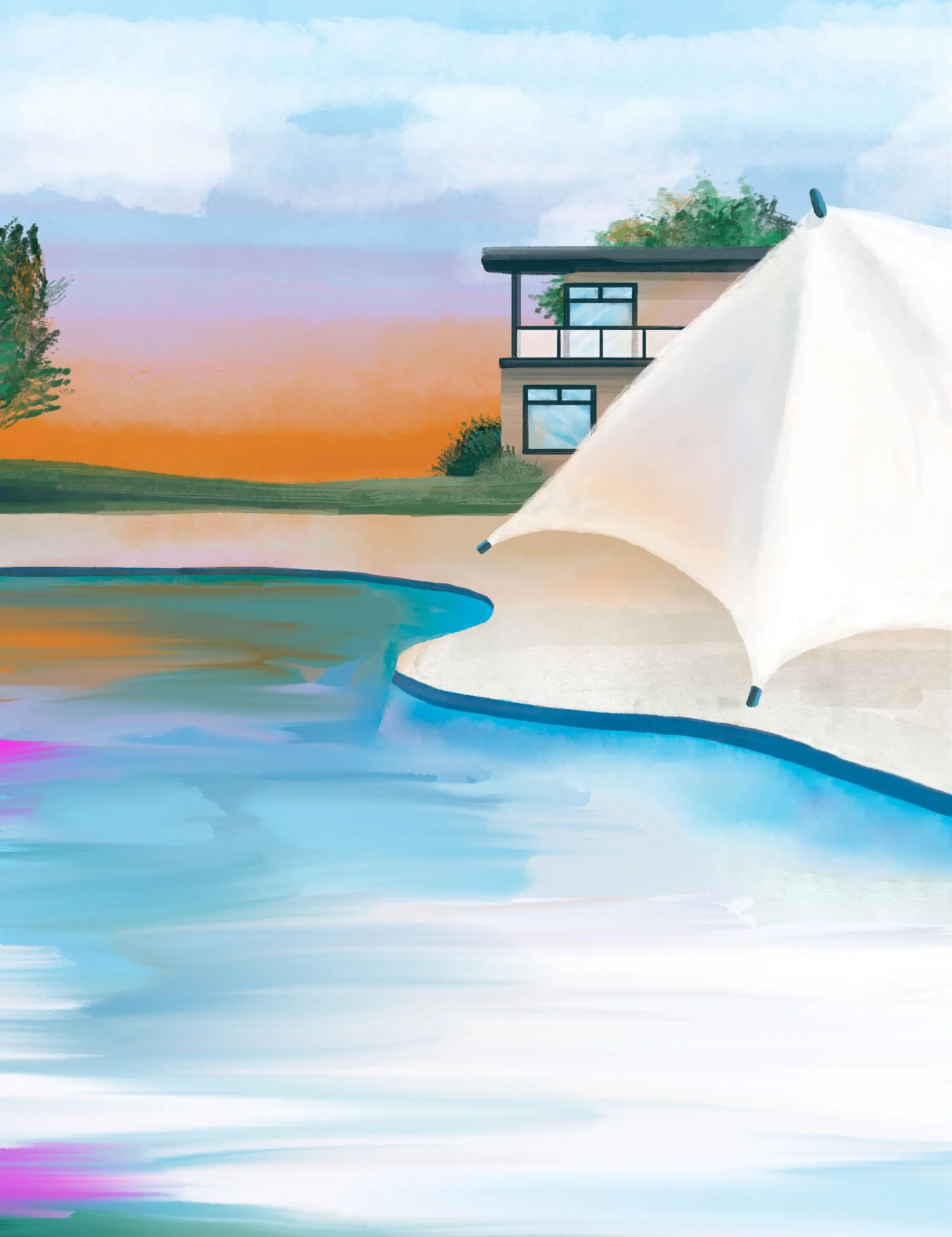
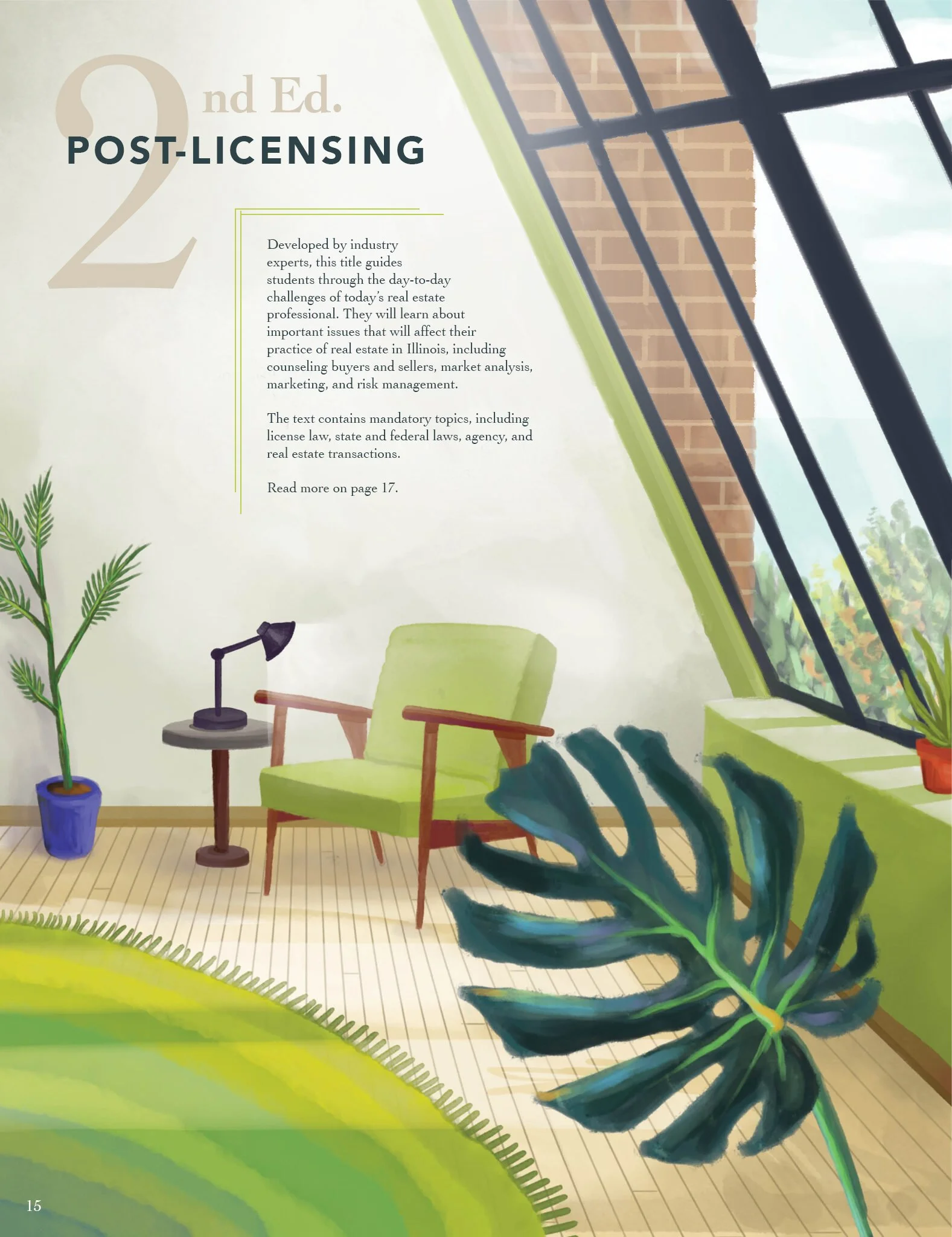
My role: The annual catalog is segmented into nine real estate sections, each with a full-page divider denoting the section. For the 2020 theme, custom digital illustrations of modern interior and exterior designs with painterly qualities was chosen for these divider sections.
As lead designer on this project, my task was to illustration all the divider backgrounds and work with a page layout editor to ensure all text content fit with the established template.
SPECS
Software used: Wacom, Adobe Photoshop, Adobe InDesign
Skills: Digital illustration, photo editing, graphic design, creative direction, branding, project management
The process
PROBLEM SOLVING
The biggest obstacle I faced during this project was balancing the digital painting hours required to hand-make every illustration on top of being a design layout lead for the magazine and other company product lines. Creating a painterly look that looked consistent, professional, interesting, but also didn’t detract from the catalog’s messaging took discipline and several rounds of iteration.
SOLUTIONING
To manage the time workload needed to complete the digital illustrations for print production, I developed and maintained a consistent schedule and process for each illustration. First, reference photos were collected for each illustration, keeping in mind composition and areas that could be manipulated to created white space for text overlays.
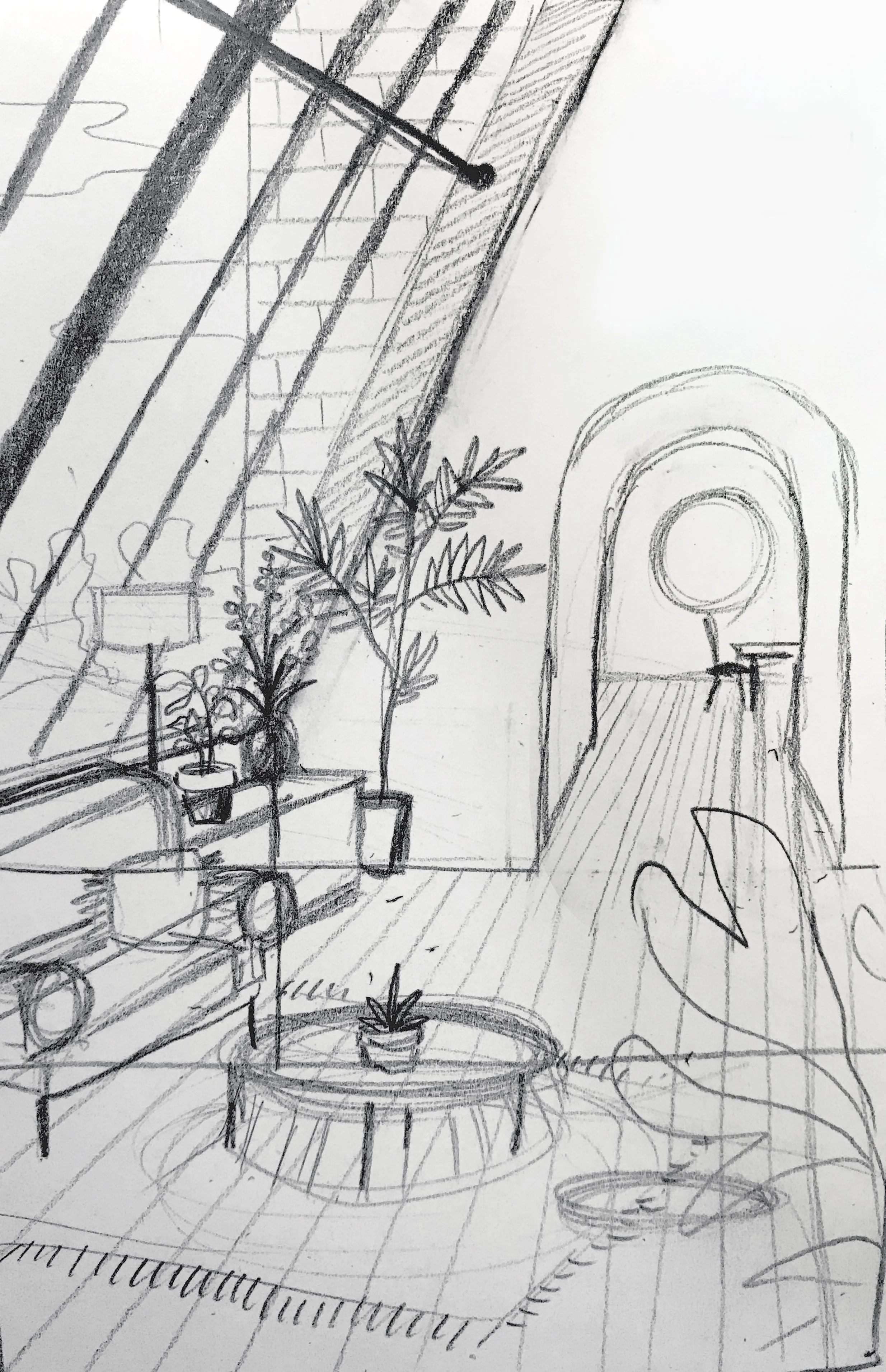
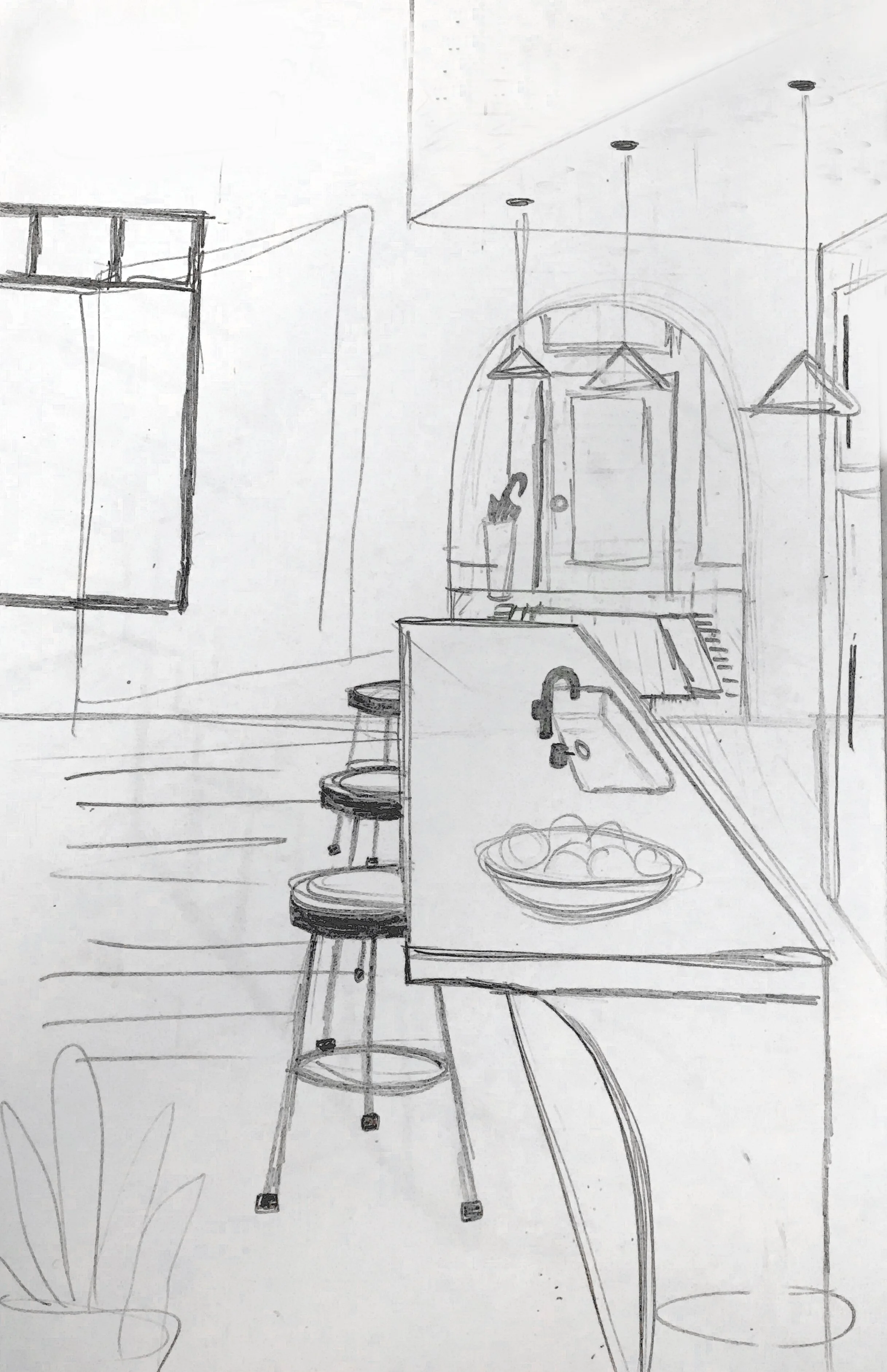
After reference photos were chosen and approved by the creative team, I drew rough sketches on paper that would be used as the base for my digital illustrations.
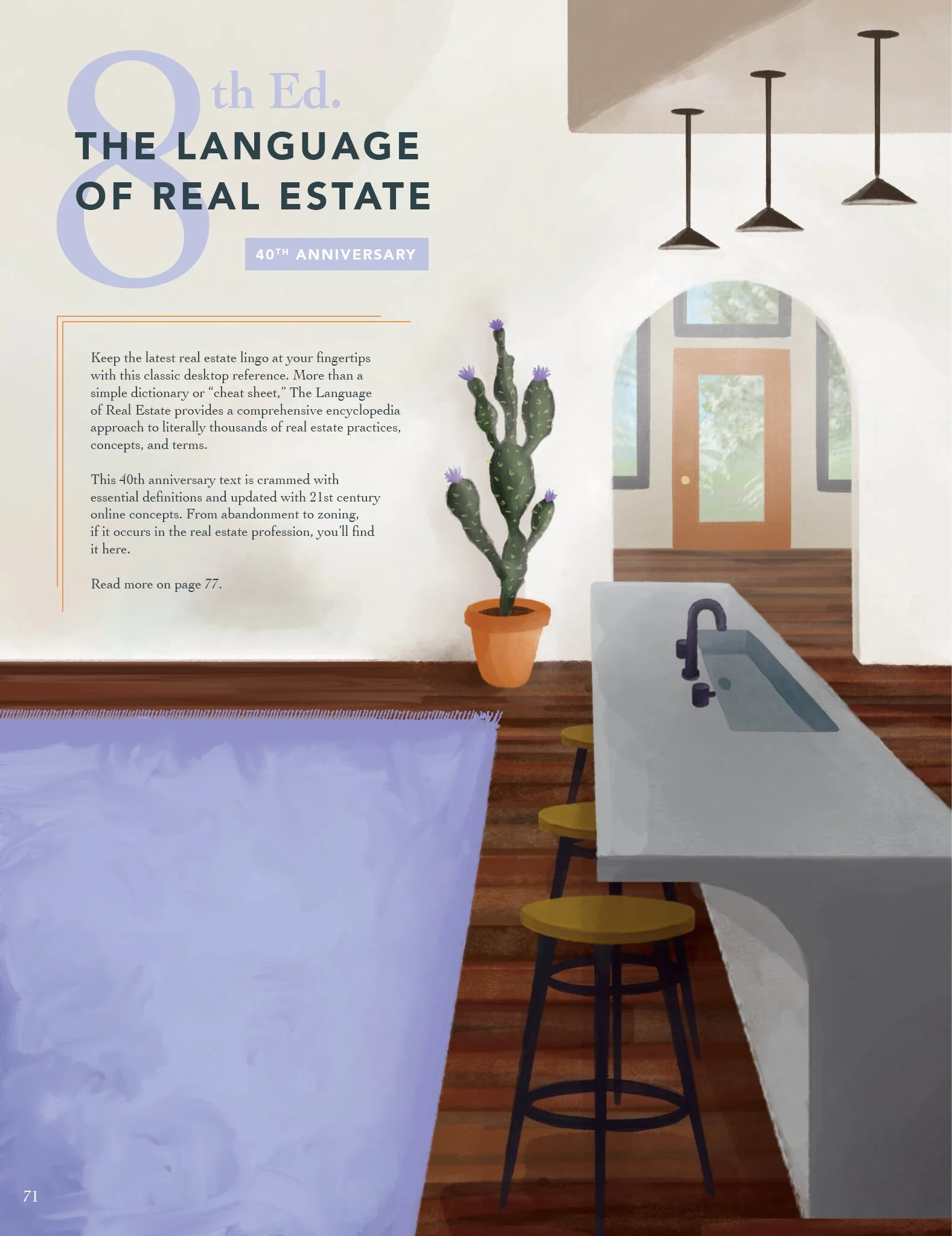
The paper illustrations were used as a base layer in Adobe Photoshop for digital painting, building up layers of color, texture, and detail. I edited or removed details to the layouts as needed for future text integration. Using a limited color palette and brush library helped speed the digital painting process along and stay within the project timeline.
Once the digital illustrations were complete, I was able to integrate the text on top of the illustrations. Working with the production manager and copy editor, I used color theory and layout design to finish the final page compositions. Industry-standard press-ready exports were important for the next stage of print production.
PROJECT REFLECTION
This project was an engaging experience because of the artistic challenges required to create digital illustrations, but also satisfying because of the smooth process from establishing a realistic timeline and sticking to a strict routine for maintaining progress.
Another fulfilling part of this project was the ability to visit the project’s print production facility in person. To ensure quality control in print production, the production manager and I toured our partnering print facility and oversaw the initial press run of the catalog. Quality checks for color accuracy, image resolution, alignment, and any defects in the printed material were examined. We were also able to evaluate firsthand the type, condition, and capabilities of the printing equipment and technology being used.

